In a previous blog “Engaging Portraits” I talked about unique lighting for each portrait. In the beginning, near everyone starts out with the same body parts, but that’s where the similarity ends. We are not made from the same mold and each of us has features and characteristics that make us, well us. To set up a style of light and use it for everyone makes a statement about the photographer, not the subject being photographed. Our characteristics, personality and physical features are what make us who we are. We are all pieces of art worthy of being celebrated.
A sculptor said the sculpture was already in the rock and he just chipped away the unnecessary parts to reveal the beauty that was within the rock. As a photographer I sculpt with light to emphasize the highlights of each subject, but just as each subject is different each subject requires a different light.
Five subjects from a business portrait session last year have given me permission to use their portrait to illustrate what I mean. Some have asked that I not use their name, so none of the five names will be used.
The comments and observations expressed are my opinion only, but the lighting described is based on sound photographic training and practices.
Engaging Portraits – Sample Two
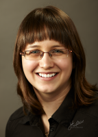
Subject number two is the most senior (by age) I photographed on this assignment. His years of experience and service were my main focus in creating his portrait. I wanted to feature his age but in a very positive way.
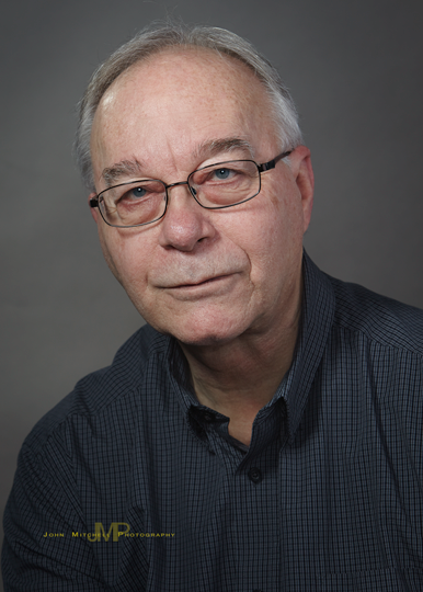
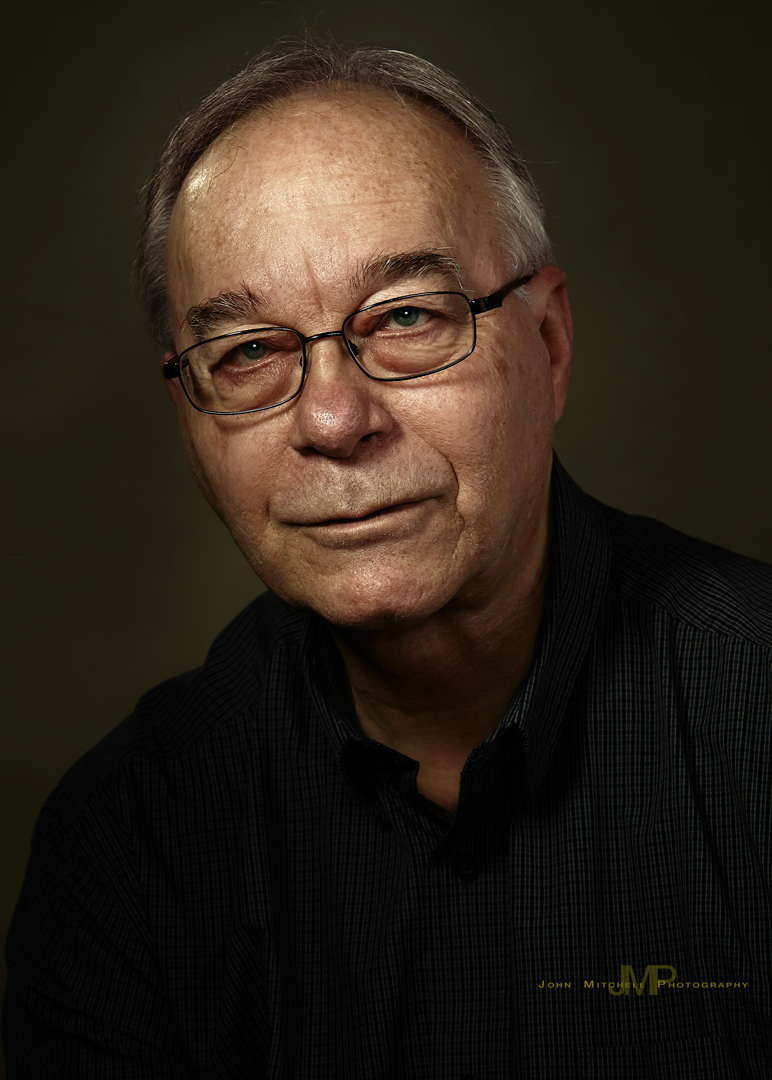
Above are two different versions of the same finished image.
The image on the left was made at the time of the assignment and tied in with the portraits of everyone else for contrast, colour and density. I still like this portrait.
The image on the right “Sample B” is the same file, just created. My favourite artists are the Dutch masters and in particular Rembrandt. I have recently studied some amazing photographers from Russia and am very impressed with their success in duplicating the look of the great Dutch masters in their photography. I am experimenting with the look. A first response might be it is too dark, but I encourage you to study the larger version below. I believe you will find the facial detail is greatly improved. The darker image will direct your focus to the mask of the face.
Please take a moment and let me know what you think.
Now for the pose and lighting.
Pose
In 90+% of individual portraits I believe in a diagonal composition and will either lean the subject or tilt the camera. I am careful to lean the subject into the frame of the portrait and not have them falling out of the picture (an error I see done by far to many photographers). Why do I lean the subject? A horizontal portrait psychologically creates a feeling of at rest. If I am looking for a very relaxed peaceful look I might use this, however one has to be careful not to create a feeling of extreme rest (death) in such compositions. Contrarily a vertical image is strong, forceful, upright and stiff. It can be unapproachable and very forceful and can be perfect for certain images of an authority figure.
Fill Light
In choosing my fill light I wanted to make sure there was not going to be a problem with glare in the glasses. I chose a parabolic light bounced off the ceiling and employed barn-doors to keep the light from making direct contact with the subject.
Main Light
I wanted to feature his years of experience but I didn’t want it to be a character portrait that emphasized his lines and texture. Therefore the light had to be strong, ruling out a softbox, umbrella or beauty dish. Too hard a light would have deepened the shadows of any facial lines and not been flattering. I selected a 16 inch parabolic reflector with barn-doors. The barn-doors were left fairly well open to increase the size of the light relative to the subject. I also brought the light closer to the subject, increasing the size of the light relative to the face.
Next was selecting the angle of the light. Because I wanted to show the texture but not over emphasize the facial lines I decided to place the light just off the axis of the mask of the face. This resulted in a small modified butterfly shadow just under the nose. This also helped to bring the focus of the portrait to the mask of the face.
Accent
The lighting was finished with the addition of an accent light to the right and slightly behind the subject. This light helped to round the shape of the subjects face and give it dimension.
Post Processing
In the post processing of “Sample B” I adjusted the RAW file to warm the colour temperature to give it a appealing and old master look. I then increased the contrast and decreased the saturation. Some minor work was done to lighten the shadow of the creases in the forehead and under the eyes.
The image was lightly vignette before being converted to a Photoshop file.
In Photoshop I highlighted the eyes, and made a corrected a color tinge in the grey hair. Finally, a very light layer of skin softening was applied and then further reduced.
Results
I am happy with the warm deep feelings in the portrait. I particularly like the way the light draws attention to the mask of the face. I look forward to further developing this technique in future portraits and as always encourage your feedback and comments.